


Printing Digital Downloads at Home Without Them Looking Cheap
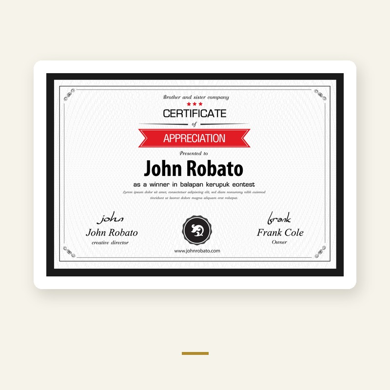
The file is usually not the problem. Four settings and one sheet of paper decide most of the outcome.
Paper does more than the printer
A decent inkjet on 200 gsm matte paper looks better than an expensive printer on 80 gsm copy paper. Copy paper is thin, it cockles where the ink lands, and colour sinks into it and goes dull.
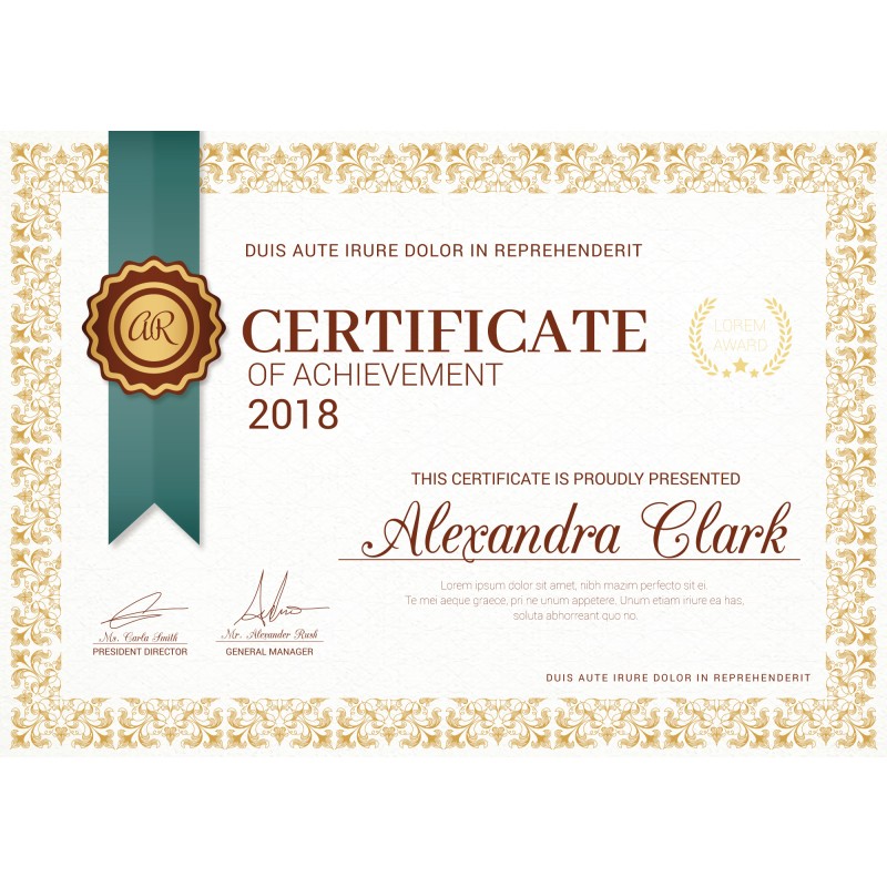
For printables, look for paper labelled matte, 160 to 250 gsm. For cards and certificate-style designs, 250 to 300 gsm. For photos, a satin or lustre finish usually flatters skin tones better than high gloss.
Turn off the printer's economy settings
Draft or economy mode reduces the ink it lays down. Colours come out pale and flat. Set print quality to high or best, and if there is a paper type setting, match it to what you loaded. Printers adjust ink volume based on that selection, and choosing plain paper when you have loaded matte photo paper is a common reason prints look weak.
Let the software manage colour
RGB and CMYK are different colour spaces. Files made for screens are RGB; the printer converts them at print time. If both the application and the printer driver try to manage the conversion, you get double correction and muddy colour.
Pick one. In most home setups the simplest is to let the printer handle it and leave colour management in the app alone.
Print at actual size
Choose 100 percent scale, not fit to page. Fit to page silently rescales the artwork, which changes margins and can crop the design. If the design is meant to have a white border, that border is part of the layout.
Check the preview once
Before committing to a full run, print one page and look at it under the light it will live in. Screens are backlit and prints are not, so a print usually looks slightly darker. If it reads as too dark in daylight, raise brightness a touch rather than reprinting repeatedly.
Matte, gloss and where the print goes
Matte suits text-heavy and line-art designs and does not reflect a window. Gloss and satin show deeper blacks and richer colour, but glare makes them awkward under direct light. For anything going behind glass, matte is the safer choice.
One more thing worth doing: print two pages of a longer set and compare them before printing the rest. Ink levels shift between sessions, and catching that early saves a whole stack.