


How to Choose the Right Certificate Template for Your Event
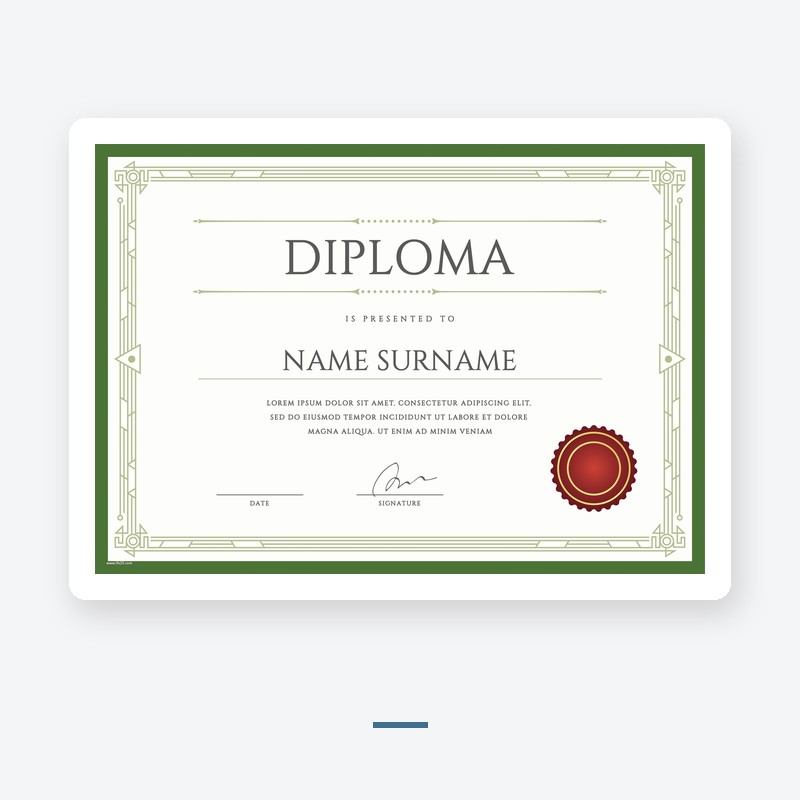
A certificate template is not a neutral background. The border, the orientation, the color and the editable format all send a signal before anyone reads the words. Picking a template is easier if you decide three things first: what the certificate is for, how it will be printed, and how it will be handed over.
Start with the event
A completion certificate, an award, a training certificate and a volunteer recognition all have different tones. Completion certificates can be clean and modern. Awards usually want a heavier border and a more formal layout. Training certificates need room for the course name and the hours. If you pick a template before you know the event, you will end up forcing the wording into a layout that does not fit it.
Landscape or portrait
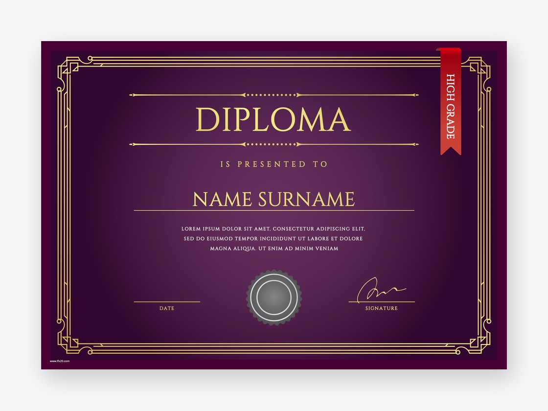
Landscape is the default for certificates that will be framed or handed out at a ceremony, because the name and the award line sit naturally across the page. Portrait works better for certificates that will be filed, inserted into a folder, or printed as part of a packet. Neither is wrong, but the orientation should match how the certificate will be used after the event.
The editable format
This is the part buyers miss. EPS is for professional print shops and needs design software. Word templates are the easiest for most people to edit. Canva-ready templates are convenient but lock you into that platform. JPG and PDF are for printing, not editing. If the listing says editable but the file is a flat JPG, you will be retyping the whole certificate in another program. Check the format line before you fall in love with the design.
Color and print
A template with a heavy dark background looks rich on screen and drinks ink on a home printer. A white or cream background with a colored border prints cleanly and still looks formal. If you are printing at home, check that the border has enough margin that a slightly off-center print does not cut it off. If you are sending it to a print shop, the dark background is fine, but ask for a proof before the full run.
What to check in the preview
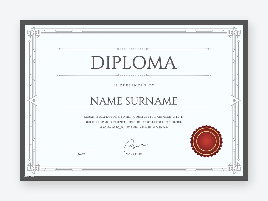
Look at the name line and the date line. Are they large enough to read across a room? Is there room for a long name and a long event title? Does the signature area have space for two signatories, or only one? A template that looks balanced with short placeholder text can fall apart when the real name is longer than the preview. Check the preview with a realistic name before you buy.
A quick checklist
Before you buy, confirm: the event type, the orientation, the editable format, the print method, the margin around the border, and the space for the name, date and signatures. If all six fit, the template will work. If one of them does not, no amount of font changes will fix it.